
A blank dining room wall is a missed chance. Guests sit for hours, talk, laugh, and stare at the same empty paint. The right dining room gallery wall ideas fix the problem fast. Art adds color, warmth, and personality without crowding the table.
The best modern walls are edited and calm. Think fewer pieces, richer materials, and plenty of space between frames. Slim oak frames, limewash paint, and soft picture lights do more than a crowded cluster ever could.
Below are twelve ideas for houses, apartments, and rentals. Each one covers spacing, frame finishes, colors, and common mistakes. Pick a favorite, save it, and borrow whatever suits your room.
1. Dining Room Gallery Wall Ideas Built on a Warm-White Palette
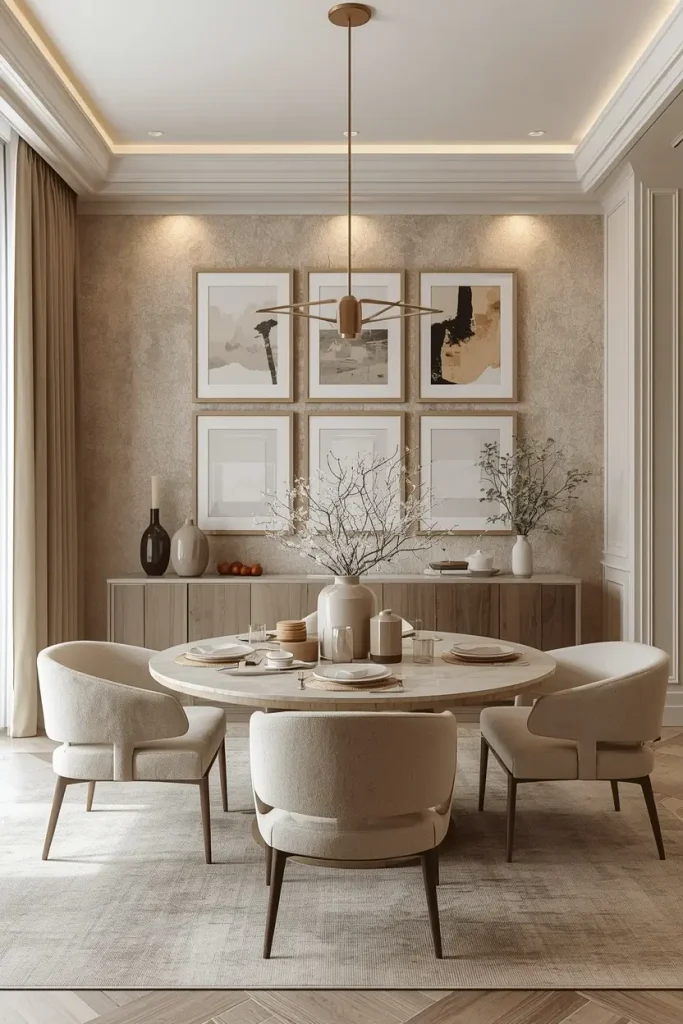
Start with color. Choose soft abstract prints in warm white, oatmeal, and pale sand. Hang them on a creamy plaster-effect wall. The look feels calm and costly, and it never fights with the table.
Use wide white mats inside slim oak frames. Wide mats give each piece room to breathe. Simple art then looks gallery-grade instead of bland.
Keep the gaps even. Two inches works well. Equal spacing makes the group read as one bold piece.
Add one textured item, such as a paper relief or a linen-wrapped canvas. Texture adds depth without adding color. Mix frame depths a little, too. When every frame has the same finish, the wall goes flat.
2. One Oversized Artwork Above a Slim Sideboard
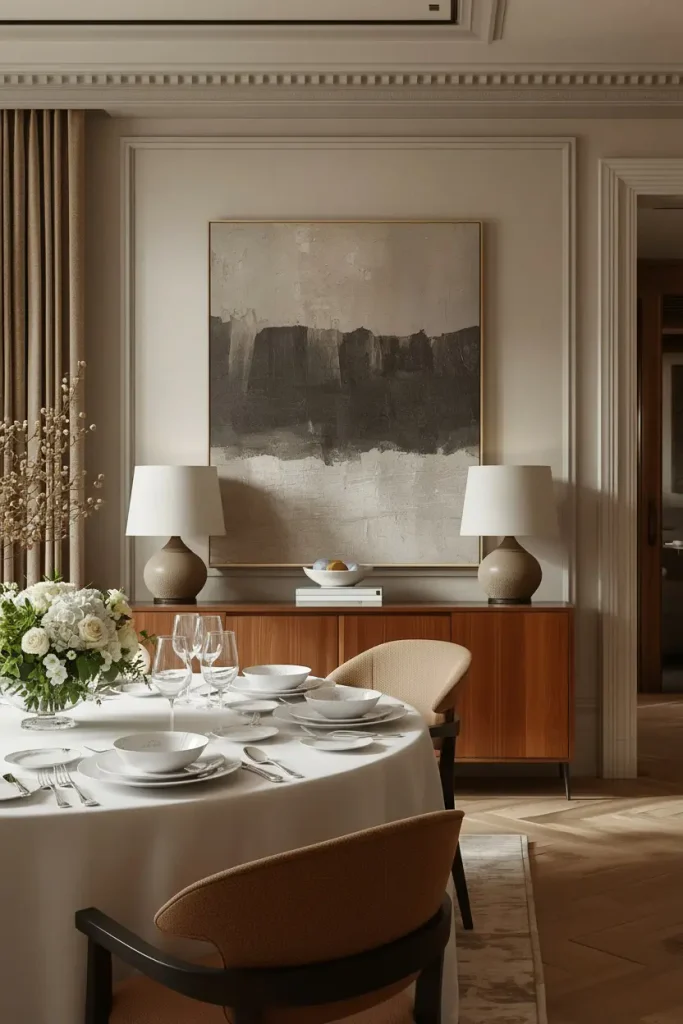
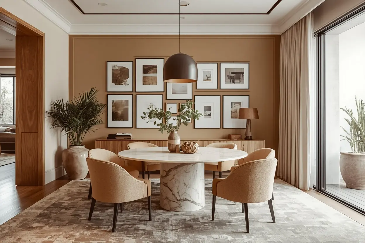
Sometimes one piece beats twelve. A large canvas can fill a wall better than a crowd of small frames. Pick a textured abstract in mushroom, clay, and charcoal.
Size matters. Aim for about two-thirds the width of your sideboard. Hang the art six to eight inches above the surface. The two will read as one unit.
Choose a low oak or walnut sideboard. Add a pair of small ceramic lamps for warm light at dinner.
Beginners love this idea. There is no layout to plan and no gaps to measure. If the wall still feels bare, add one slim ledge with a single sculptural vase. Then stop. Restraint is what makes the look feel high-end.
3. Thin Black Frames on a Limewash Wall
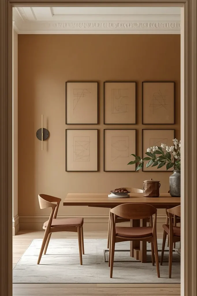
Limewash gives walls a soft, cloudy finish. Flat paint cannot match it. Against warm greige or pale taupe, slim matte black frames look crisp and graphic.
Keep the layout simple. Hang four or six same-size frames in two neat rows. Tidy rows balance the soft texture behind them. Fill the frames with line drawings, architectural sketches, or black-and-white plant studies.
Thin frames work best, about half an inch wide. Chunky black borders pull the eye from the art. They can also make a dining room feel dark.
Add a dimmable wall sconce nearby. Warm light softens the contrast at night.
On a budget, buy basic ready-made frames and spray them matte black. Nobody will guess.
4. Botanical Prints Against Sage Green
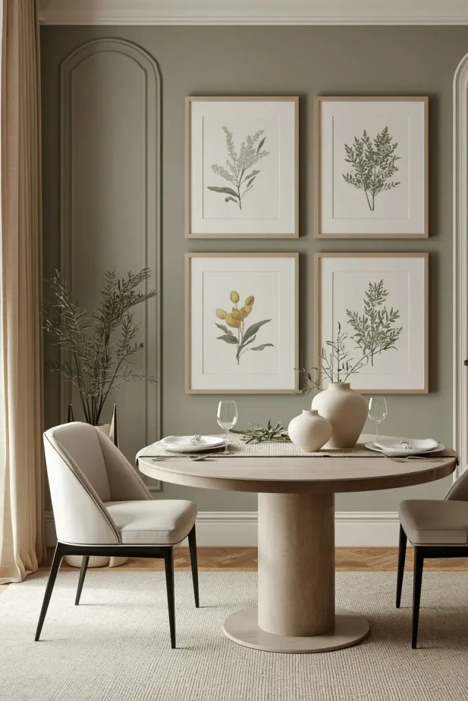
Sage green flatters a dining room all day. It feels fresh in daylight and cozy under lamps. Pair it with pressed-flower or watercolor-style prints in cream mats and pale oak frames.
Hang five or seven pieces in a loose, staggered layout. Mix portrait and landscape shapes. The uneven rhythm feels collected. Matching frames keep it neat.
Pick prints with plenty of empty space. A single olive branch or fern leaf looks modern. Busy bouquets can push a room toward old-fashioned.
Tie the wall to the table. A linen runner or a bowl of fresh greenery echoes the colors in the art. Small links like these make a room feel planned, not accidental.
5. Layered Picture Ledges for Easy Changes
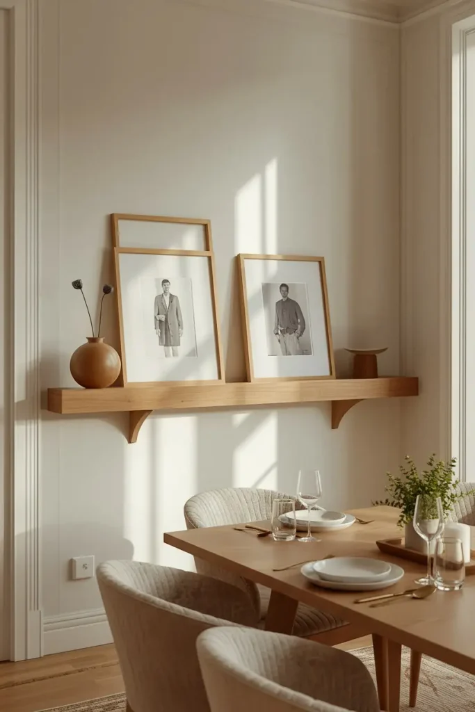
Picture ledges suit renters and restless decorators. Mount two long oak ledges at different heights. Lean frames, mirrors, and small objects on them. No dozen nail holes needed.
Layer for depth. Place a large frame at the back. Tilt a smaller one in front. Add a ceramic bud vase at the edge. Overlap makes the display look styled, not stored.
Keep colors tight. Warm white, soft black, and natural wood make a safe trio. Add one or two aged-looking objects, like a small brass bowl or a stone candleholder. They keep the wall from looking too perfect.
Dust loves ledges. Edit often. Fewer, better pieces always look cleaner.
6. Mirrors Mixed with Art and Brushed Brass
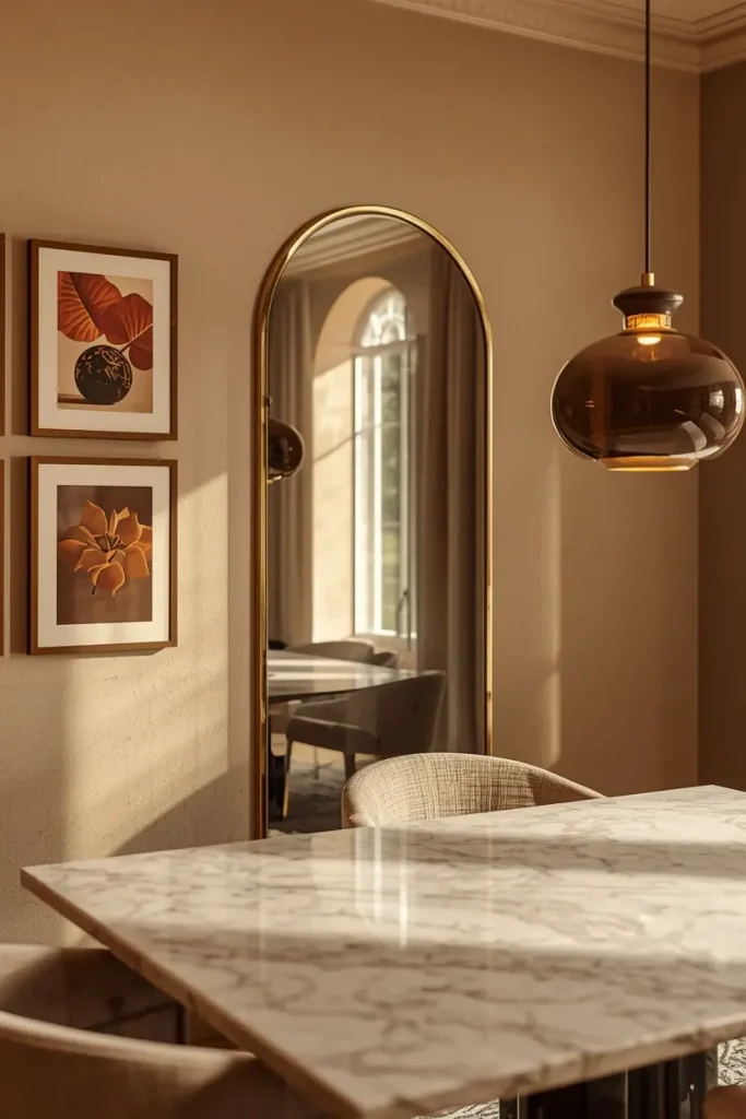
A mirror does two jobs in a gallery wall. It bounces light around the room. It also adds a new shape and surface to the mix.
Choose an arched or softly rounded mirror with a brushed brass edge. Make it the anchor. Build around it with three or four framed prints in warm tones. Curves soften all the sharp corners of the frames, which is very much today’s look.
Placement matters. Hang the mirror where it catches window light or a pendant glow. Avoid the spot directly across from the table. Nobody wants to watch themselves eat.
Shift the mirror toward one side for a relaxed feel. Warm metals glow beautifully by candlelight, so brass suits dining rooms well.
7. Contemporary Landscapes in Walnut Frames
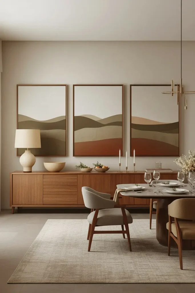
Landscape art makes a dining room feel grounded. Skip old-style oil paintings. Choose modern versions with muted horizons, hazy hills, and abstract coastlines. Olive, sand, and soft terracotta work well.
Walnut frames add richness. The dark, warm grain looks lovely against a pale wall. Hang three pieces in a row above a long sideboard. Make the center piece slightly larger.
Go big. Small landscapes get lost on a dining wall. Choose pieces at least 20 by 30 inches.
On a budget, order large prints on matte paper. Add proper mats and good frames. Quality framing makes affordable art look expensive.
Place a tapered ceramic lamp below to repeat the warm, earthy mood.
8. Black-and-White Photography on a Charcoal Wall
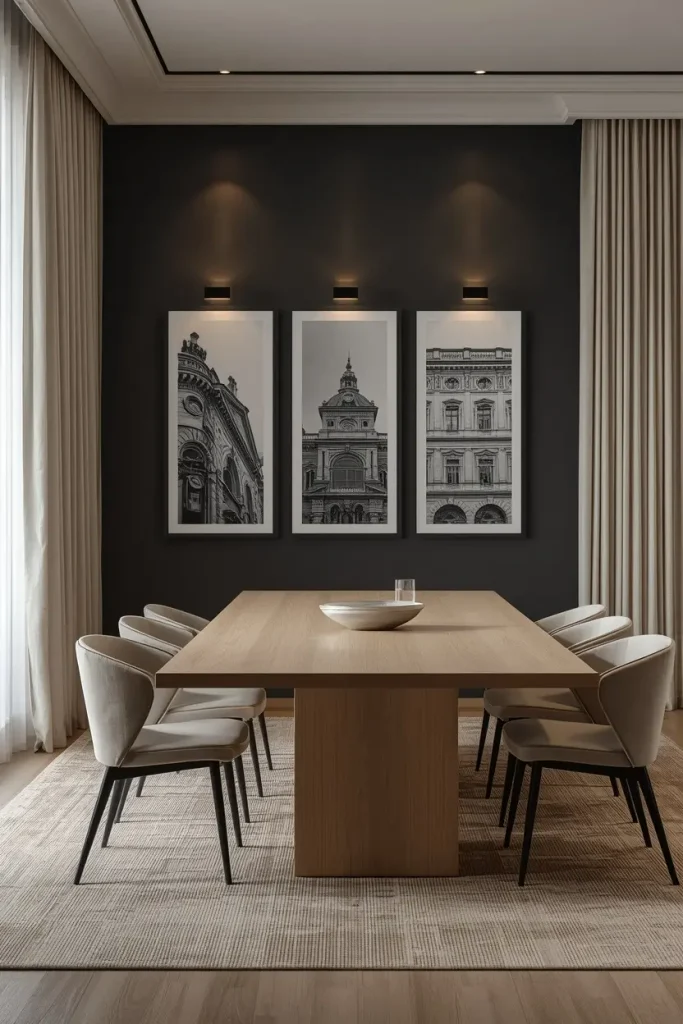
Want drama? Try black-and-white photos on a deep charcoal wall. The images seem to glow against the dark paint. White mats make the glow stronger.
Pick one theme. Architectural details, cloud studies, or portraits of hands all work. A shared subject lets you mix frame sizes without chaos.
Dark walls need good lighting. Add slim picture lights or aim two adjustable spotlights at the group. Without light, the mood turns gloomy.
Balance the darkness. Pair the wall with pale linen curtains and a light oak floor or woven rug. Contrast keeps the room welcoming. It also keeps the room elegant instead of heavy.
9. Woven and Textile Art for a Japandi Feel
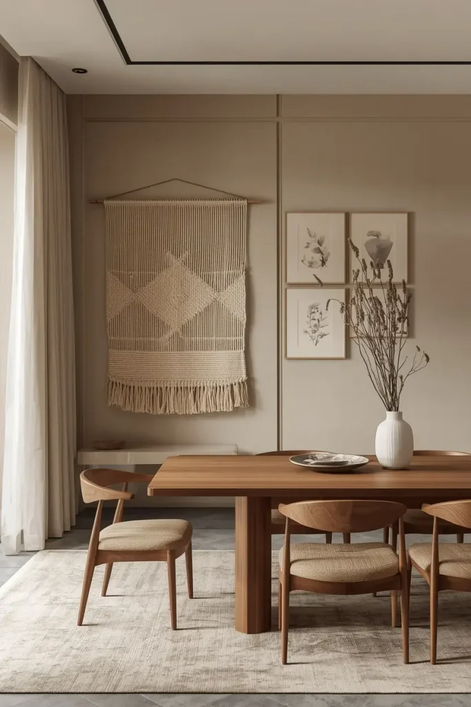
Gallery walls do not need to be flat prints. Add woven hangings, linen panels, and framed fabric swatches. Layers of texture suit Japandi style, which blends Japanese calm with Scandinavian warmth.
Start with one large woven piece in natural fiber. Add two small framed linen studies in oatmeal and soft clay. Break up the rectangles with a slim wooden rod or a handmade ceramic plate.
Textiles also soak up sound. Hard-surfaced dining rooms can echo. Fabric art makes dinner talk feel softer and calmer.
Keep colors quiet: cream, sand, warm gray, and a touch of black. Choose pieces with small imperfections. Handmade charm is the whole point of the style.
10. Arched Niche Galleries with Built-In Lighting
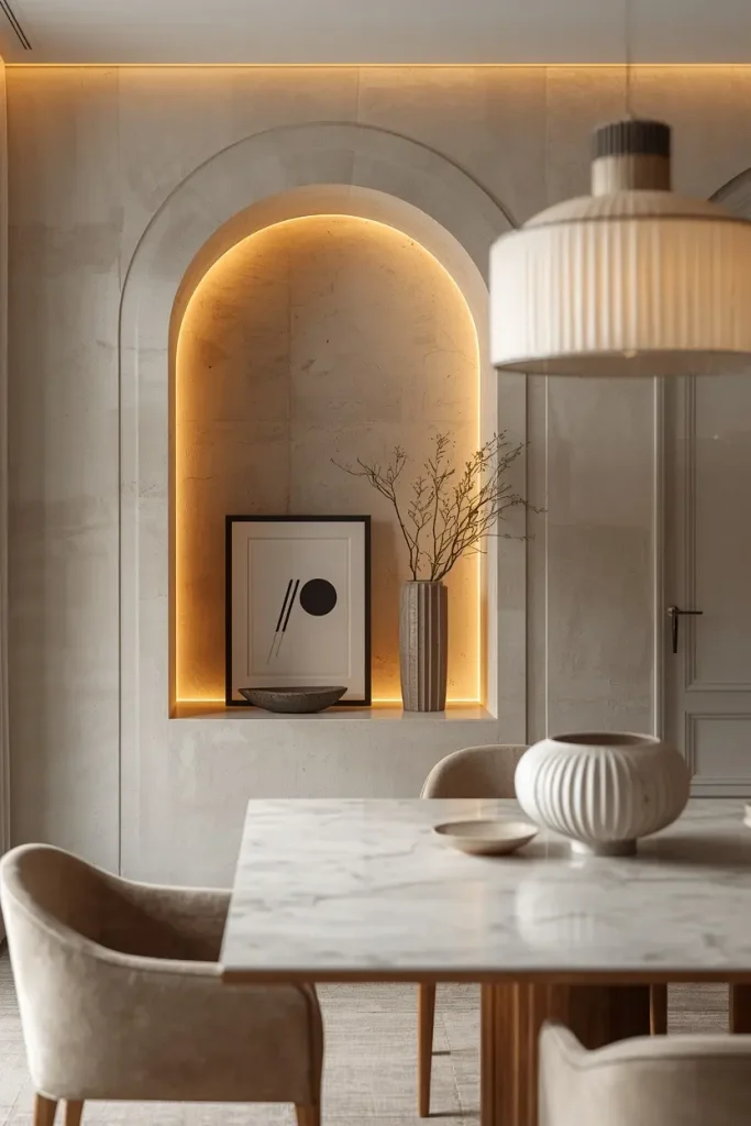
Have a recessed wall? Or planning a remodel? An arched niche makes a built-in gallery with real architectural presence. Finish the inside in textured plaster and warm white. Fill it with a small group of art and one sculptural object.
Hide LED strips along the top edge. They cast a soft glow and give the display a museum feel. Choose a warm 2700K bulb color. Wood and skin look best in it.
Lean one medium frame inside the niche instead of hanging it. Add a stone bowl or ribbed glass vase beside it. Layered depth sells the look.
No niche? Try a painted arch or faux-arch wall panels. The effect costs far less.
11. Asymmetrical Cluster with Soft Terracotta Accents
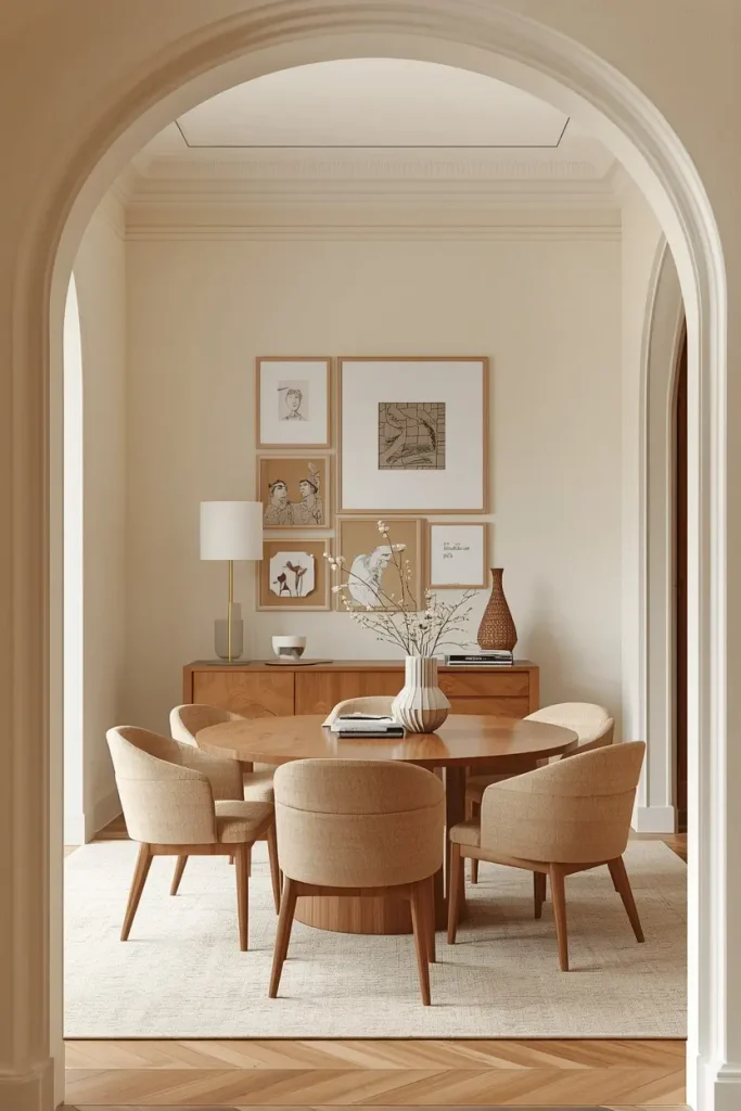
A gallery wall does not need to match on both sides. An uneven cluster feels relaxed and modern. Anchor it with a warm palette of terracotta, sand, and cream.
Begin with the largest frame, set slightly off-center. Build outward with smaller pieces. Leave gaps that vary but still feel planned.
Lay everything on the floor first. Move pieces around. Take a photo of the best layout before you hang anything. Your phone will remember what your eyes forget.
Mix textures: a paper collage, a ceramic tile, and a charcoal sketch. Use simple light wood or white frames. Let terracotta show up in the art, not the paint, so the effect stays soft.
Avoid cramming. If a piece has no breathing room, remove one.
12. A Single Horizontal Row Above a Banquette
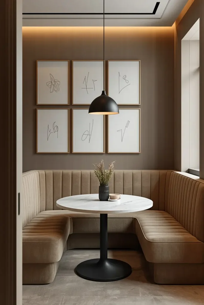
Banquette seating is everywhere right now. It also leaves a perfect strip of wall for a clean gallery. Skip the stacked layout. Hang one long row of five or six matching frames at the same height.
Small dining nooks and apartments love this idea. It adds interest without using floor space. Choose slim light oak frames with wide white mats. Fill them with soft line art or minimalist abstracts.
Mind the height. Keep the bottom of the frames at least 8 to 10 inches above the banquette back. Heads will stay safe from bumps.
Add a bouclé or leather cushion below for comfort. Equal sizes and spacing create a quiet rhythm. The wall feels calm, tidy, and architectural.
Conclusion
The best dining room gallery wall ideas are not about filling space. They are about a clear palette, good proportion, and soft lighting. Pick quality materials and let them do the work. Whether you choose one oversized canvas or a neat grid, the goal stays the same: a wall that feels calm, collected, and yours.
Not sure where to begin? Start small. Hang one piece and live with it for a week. Then add more. A wall built slowly often looks more personal than one finished in an afternoon.
Save your favorite ideas from this list. Then enjoy your next dinner in front of a wall you love.